
Lettering succeeds when the whole word is readable. Spacing, baseline and surrounding space often matter as much as the design of each individual letter.
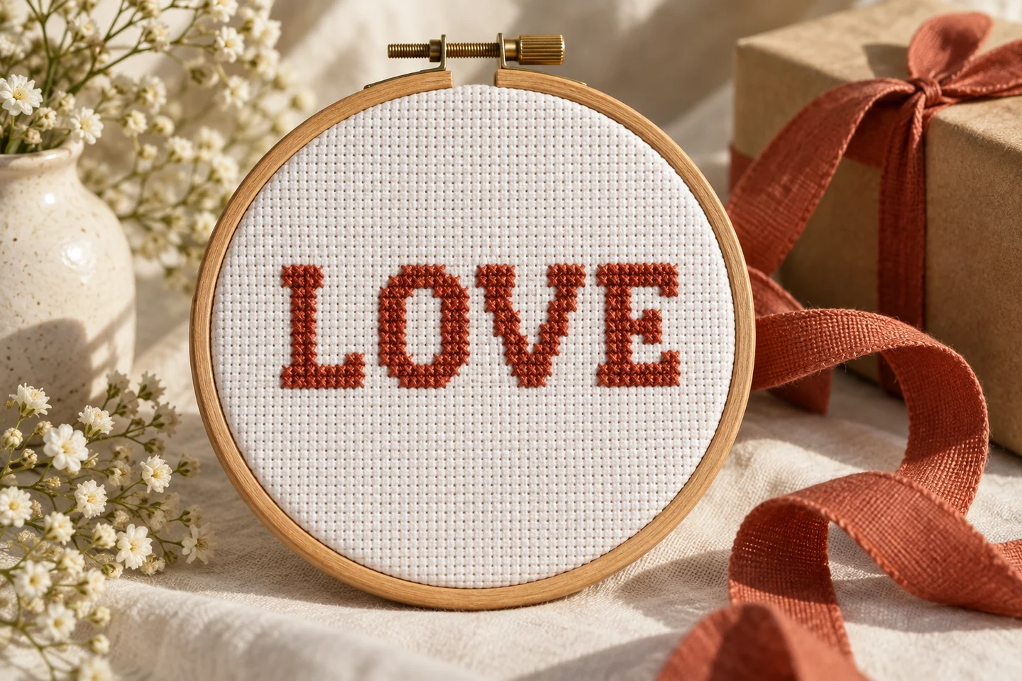
Choose an alphabet that fits
Count the available stitches before choosing a font. A five-stitch-wide alphabet is compact, but a long name still needs space between letters. Our original block alphabet is five cells wide and seven high, with one blank column between characters. It supports uppercase A–Z and spaces; it does not approximate missing accented characters.
Chart the complete word
Place every letter on the grid before stitching the first one. Include spaces, punctuation if your chosen alphabet has it, and decorative borders. Check the total width and center the complete chart. Centering the first letter on the fabric is not the same as centering the finished name.
Check visual spacing
A fixed one-column gap is predictable, but letter pairs can look uneven because their shapes differ. View the chart from a distance before deciding whether you want custom spacing. Keep a consistent baseline unless a staggered arrangement is intentional. Avoid placing a descender or border so close that it looks connected to another letter.
Stitch with reference points
Begin from the chart center or count carefully to the first letter. Check each new character against both the baseline and the previous gap. A one-stitch error can make a familiar word look surprisingly wrong. The alphabet maker produces an actual full-cross chart you can download free. Try a short word, compare it with Love Letters in the library, and calculate fabric margins after the final text width is known. For names requiring another script, use an alphabet designed for that script instead of removing meaningful characters.
Choose lettering around the finished object
A stitched name needs to fit both the available fabric and the purpose of the gift. A label on a small pouch calls for different proportions than a name centered beneath a framed motif. Begin by measuring the usable stitched area, excluding seams, folds and mounting allowances. Then decide whether the name should dominate the design or support another image. This prevents the common problem of selecting attractive letters that cannot fit the object without crowding its edges.
Use the alphabet pattern tool to explore an original uppercase block alphabet. It supports A–Z and spaces, with a maximum of thirty-two characters and three integer scale choices. It does not automatically supply accented letters, lowercase forms or every writing system. Check the person's exact spelling before committing to that alphabet. If the name needs unsupported characters, create and verify those letters on a blank grid rather than substituting a different spelling without the recipient's agreement.
Count the entire line, including spaces
Letter height alone does not tell you how wide a name will be. Each character occupies a cell width, and gaps between characters contribute to the total. In the tool's original five-by-seven alphabet, a line of n characters occupies six times n minus one columns at scale one. That fixed-width layout includes spaces as character positions. Multiply both dimensions by the selected scale, then convert stitches to inches or centimeters using the intended effective fabric count.
For example, a five-character name at the smallest scale spans twenty-nine columns and seven rows. At scale two it spans fifty-eight columns and fourteen rows. On fourteen stitches per inch, those widths are about 2.07 and 4.14 inches respectively. This is the stitched lettering only; the cut fabric needs margins as well. Use the fabric size calculator with the final grid dimensions rather than measuring a resized screen preview and assuming it represents the finished physical size.
Compare mathematical centering with visual balance
Mathematical centering places equal grid space on either side of a line. Visual centering considers how much ink—or thread—each side appears to contain. A narrow-looking I and a wide-looking M can make equally spaced uppercase lettering feel slightly unbalanced. Start with the mathematically centered placement, then inspect the complete design at its expected size. A small intentional adjustment may improve the result, but record it so your stitching reference remains clear.
Count from the chart center to the lettering start rather than guessing from the fabric edge. If the line width and the surrounding motif have different odd-even parity, their centers may fall between different columns. Decide whether to offset by one cell or adjust the surrounding spacing. The make your own chart guide explains working directly with these grid decisions. On a symmetrical gift, compare the name with the motif above it as well as with the outer fabric rectangle.
Preserve the spaces inside and between letters
Readable stitched lettering depends on negative space. The opening in an A, P or R and the gap between neighboring letters help the eye identify the word. If stitches crowd those spaces, letters can merge even when every individual cell matches the chart. Check pairs such as RN, which may resemble M at small sizes, and adjacent vertical strokes that look like one heavy block. View the lettering from a normal reading distance, not only close to the grid.
Avoid filling accidental gaps by pulling the thread tighter. Tension changes the fabric and cannot repair an unclear design. Instead, revise the chart before stitching or choose a larger scale if the object allows it. A one-cell gap is a deliberate design element, so count it as carefully as a stitched cell. The grid sizes guide explains why increasing resolution can protect small features, while simply enlarging the printed chart makes it easier to read without adding any actual design detail.
Make multi-line designs as a planned layout
Long phrases are often easier to arrange across several lines than to squeeze into one narrow strip. The alphabet tool generates a single line, so plan multiple lines as separate charts and combine their placement on a master grid. Write down each line's stitch dimensions, the chosen vertical gap and the total height. Do not improvise the second line after the first is stitched; the available fabric and the composition need to work together from the beginning.
Choose line breaks according to meaning as well as width. A person's first and last name, a date, and a short greeting should remain easy to understand. Align lines consistently unless an intentional design calls for variation. Test the layout with a paper grid and leave room between lettering and any border. The alphabet gifts guide offers ways to coordinate text with small motifs without turning every available square into decoration or making the name compete with the surrounding picture.
Select colors for legibility before decoration
A favorite color is a useful starting point, but lettering needs enough contrast with the fabric to remain readable. Very pale thread on pale cloth may disappear at a distance, while several similar shades within a tiny word can break up the letter shapes. Try one strong color for the main name and reserve accent colors for a border or motif. This creates a clear hierarchy and simplifies the stitching process for a first personalized project.
Test real thread against the actual cloth under neutral light. Screen colors and printed previews cannot guarantee a physical match, and the site's generic palette is not a manufacturer shade conversion. If you want a variegated effect, stitch a sample to see how the color changes distribute across short strokes. A subtle thread may look beautiful in a skein but produce inconsistent contrast in a small letter. The color selection article provides a broader approach to judging value differences before focusing on small hue variations.
Stitch in an order that supports accurate counting
You can stitch letters individually or work across the line by color, but keep a reliable reference for their positions. Complete and check the first letter before traveling to a distant one. Count the unstitched gap from a known point and verify the baseline so the word does not gradually drift. On open fabric, long dark thread carries may show through the spaces. Secure and restart thread where that produces a cleaner result for your fabric and finish.
Keep the direction of the top cross consistent across the word so light reflects evenly from the stitches. Use a comfortable thread length and maintain gentle, repeatable tension. If one letter is misplaced, correct it while the surrounding area is small; compensating with irregular gaps often makes the error more visible. The beginner stitching guide covers these fundamentals. A short practice word on a scrap is a worthwhile rehearsal before you personalize an object that is difficult or expensive to replace.
Proofread before stitching and before finishing
Names deserve a final independent check. Compare the chart with the exact spelling supplied by the recipient, including initials and the intended order of names. For dates, write out what each number means so regional date conventions do not introduce ambiguity. If you are making a surprise, use a reliable written reference rather than memory. Once the chart is approved, save that version and avoid making casual spacing or spelling edits while stitching from another copy.
After stitching, inspect every letter, gap and baseline before mounting or sewing the piece into its final object. Check the result from a distance and in the intended orientation. Leave enough fabric around the text for the finish, using the framing margin guide when relevant. For a simple companion motif, the Little Heart chart can support a name without overwhelming it. A successful personalized design gives the words room to be recognized and the maker room to finish the object neatly.
Cross stitch alphabet & text maker · Download the original love letters pattern
Examples, diagrams and planning estimates are original Cross Stitch Creator content.