
A good chart communicates every stitch without making you guess. Judge readability, coordinates and the legend before judging the beauty of the cover image.
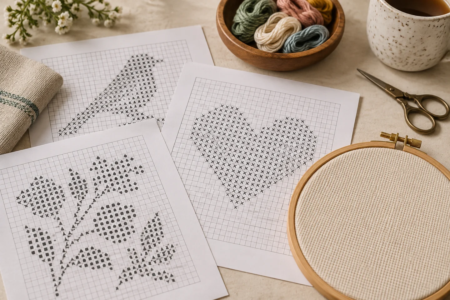
Symbols must stand on their own
Color is a useful aid, but a chart should remain understandable in black and white. Each thread needs a distinct symbol that survives normal printing. Nearly identical dots or tiny decorative icons can become indistinguishable at actual size. Compare the key with the densest section of the design and check that no symbol is used for two different colors.
The grid needs a clear scale
Ten-square guide lines make counting more reliable than a uniform maze of thin rules. Row and column labels should be legible and consistent. On a multipage chart, you need to know whether neighboring pages overlap. Repeated overlap stitches are reference material, not additional stitches to sew twice.
The instructions should settle ambiguities
A chart should tell you whether empty squares are blank fabric, how many strands to use, and whether special stitches are present. The stitch count and fabric count let you verify finished dimensions yourself. If a file claims a 100-stitch design is ten inches wide on 14-count Aida, something needs checking: the actual width is about 7.14 inches.
Test a page before committing
Print a busy page using the same printer settings you intend to use later. Confirm the symbols are sharp, the edges are not clipped and the legend is easy to locate. Our chart PDFs use a numbered map when multiple sections are needed. The free Nordic Star is a compact way to inspect this format. You can also print a blank grid to practice labeling coordinates or sketch a simple motif of your own.
Begin with a complete set of information
Before judging a chart's visual style, check whether it supplies the information needed to reproduce the design. You should be able to find the full stitch width and height, the meaning of each symbol, the intended fabric or effective count, and any special techniques. If the chart uses more than full crosses, those stitches need their own explanations. A cover image alone cannot settle an ambiguous instruction, especially when the printed preview has been reduced for the page.
This basic audit takes only a few minutes and can prevent an expensive mistake in fabric or thread. Write the dimensions down, count the legend entries, and identify whether white-looking cells are stitches or unworked cloth. Compare the preview and chart to make sure both describe the same motif. Our free library provides full-cross charts with deliberately limited palettes, while the chart generator article explains how our saved grid becomes a PDF. The goal is a consistent set of instructions, not simply an attractive document cover.
Check symbols at the size you will actually use
Distinct symbols on a large monitor can become confusing on an ordinary printed page. Test a dense section at actual print size rather than relying on an enlarged screenshot. Compare similar shapes: a small circle and a dot, two narrow letters, or symbols distinguished only by a faint line can be difficult to tell apart. If you have to guess repeatedly, the chart is not supporting accurate work even if every symbol is technically present.
Color should supplement this system rather than replace it. Two shades may print alike, and a low-ink cartridge can change contrast unexpectedly. A useful chart remains intelligible when printed in black and white. Our color-versus-monochrome guide explains how to compare the two versions. Also test your progress-marking method: a dark highlighter may hide a symbol that was initially readable. Preserve a clean digital copy so you can revisit an uncertain square without trying to decipher a heavily marked working page.
Verify that dimensions agree with the stated fabric
A simple calculation can expose contradictory instructions. Divide the stitch width and height by the effective stitches per inch. If the chart has 112 columns on 14-count Aida, the stitched width is eight inches. A claimed six-inch width would need an explanation, such as a different fabric count or dimensions that exclude part of the design. Do not choose whichever number fits the frame you already own; establish which one is correct.
Use the fabric size calculator as an independent check and include margins separately. Over-two stitching requires particular care because the actual thread count and effective stitch count differ. A 28-count evenweave worked over two yields 14 stitches per inch, not 28. The Aida count guide describes this distinction. A good pattern should not require a reader to infer such a consequential setting from a styled photograph. Clear size information connects the chart to the real material and makes substitutions much safer.
Follow one color from legend to grid to preview
Choose a noticeable palette entry and trace where it appears. Its symbol should identify the same color throughout the chart. The number of filled cells, if supplied, should be plausible for the regions shown. A color used for a large background should not have a stitch count smaller than an isolated accent unless some other instruction explains the difference. This spot check is especially valuable for converted photo patterns with many similar shades.
Do the same for an empty area. If the preview shows visible fabric between two leaves, the corresponding chart cells should remain blank unless the pattern intentionally uses a background color. Confusing blank cells with white thread can turn an open motif into unnecessary full coverage. In our original Nordic Star chart, the visible space around the shape is unstitched. The exact palette can be substituted thoughtfully, but the symbol-to-cell relationship must remain consistent. That relationship is what makes the document a chart rather than a picture that merely resembles stitching.
Inspect page boundaries before starting a large project
Find a feature that crosses from one chart page to the next. Read the global row and column labels and confirm the continuation. Some publishers repeat a few rows or columns as a shaded overlap; others divide the design into non-overlapping rectangles. Both approaches can work if they are explained. The risk is treating repeated reference cells as new stitches and duplicating part of the motif on the fabric.
Our generated pages have no overlap and include a map when the chart requires multiple sections. The printing guide covers practical page handling. For a large chart, write the page arrangement on a separate sheet or keep the map at the front of the folder. Do not depend on loose pages staying in order after several sessions. The transition should remain understandable even if you pick up one sheet on its own: coordinates, a section number, and the complete pattern name or context are useful safeguards against working from the wrong page.
Look for useful instructions rather than impressive claims
A practical instruction tells you what to do, how to interpret a symbol, or which assumption was used in an estimate. Claims such as perfect results, exact thread quantities, or universal app compatibility are less useful when they are not supported by actual testing. Photographs vary too much for a converter to guarantee that every uploaded subject will survive a small stitch grid. Thread consumption also changes with tension, travel, and starts and stops.
A good chart can be candid about these limits while still being useful. For example, our PDFs state the working strands and geometric assumptions behind their floss estimates. The floss estimator exposes those inputs so you can adjust the plan. Generic colors are labeled as generic rather than presented as official brand codes. That transparency gives you something concrete to evaluate. When comparing downloads, favor a readable legend and clear assumptions over a long feature list that leaves the actual stitch instructions uncertain.
Make a low-cost paper test before a high-cost project
Print the cover, key, and one demanding chart page using the paper and printer you intend to use. Look for clipped labels, pale grid rules, dark cell fills that hide symbols, and text that becomes too small. Try reading several adjacent cells without zooming. Then place a ruler or line marker over the row as you would while stitching. A chart that works in this ordinary setup is more useful than one that looks beautiful only on a large display.
You can also create a miniature working test by stitching a small representative section on spare fabric. Choose a part with the kinds of color changes or gaps that concern you, rather than a conveniently solid area. This is not necessary for every small free motif, but it can reveal problems before a large personalized project. Use the blank grid maker to sketch a difficult local sequence if needed. Keep the source coordinates with that sketch so your simplified working reference does not accidentally move the design.
A reusable decision checklist for future downloads
After inspecting a chart, you should be able to answer these questions in ordinary language: what is one square, what do blank cells mean, which thread belongs to each symbol, how large is the complete design, and how do pages connect? You should also know whether the chart includes techniques beyond full crosses and whether the file is offered with permission for your intended use. An uncertain answer is a reason to seek clarification before starting, not a detail to ignore until later.
Once these essentials are clear, choose according to your own project needs. A compact full-cross design may be ideal for a first finish, while a more complex chart can be appropriate when you specifically want that challenge. Browse beginner pattern guidance if you are still deciding. The same chart-quality principles apply whether a design is free or paid: readable symbols, consistent data, honest measurements, and enough instructions to keep you from guessing. Price alone does not establish usability, and a modest original chart can be an excellent practical reference.
Blank cross stitch grid maker · Download the original nordic star pattern
Examples, diagrams and planning estimates are original Cross Stitch Creator content.