
A reduced palette should preserve the important relationships in a photo. Focus on light, middle and dark areas before deciding how many different thread colors to use.
Separate value from hue
Two shades can look different in hue but have nearly the same lightness. If a face and background merge in the preview, adding another similar color may not fix the problem. Adjust the crop or contrast so the subject is separated clearly. Check the preview in a neutral viewing environment rather than under an unusually warm screen filter.
Keep meaningful transitions
Portraits often need several steps between highlight and shadow. Graphic art may need only distinct flat colors. Compare a moderate palette with a smaller one at the same stitch dimensions. Look at important features, not just the total number of colors. If two shades have almost no visible effect, removing one can simplify the stitching.
Watch for isolated cells
Quantization and dithering can create single stitches of a shade far from its main region. These may improve the image at viewing distance but increase starts and stops. Turn light dithering off for a cleaner block-style result, then compare. A smooth gradient is not always worth a much more complicated chart.
Match real materials thoughtfully
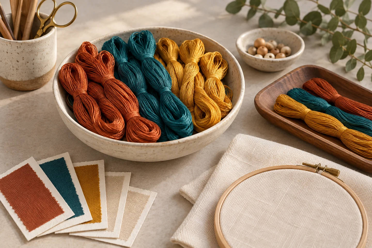
Our local converter derives generic numbered colors from the image. It does not claim that a hex value is an exact DMC or other branded floss code. Compare physical samples in suitable light, and keep neighboring colors together while choosing. Print quality also changes swatches, so use the PDF as a guide rather than a calibrated standard. Generate the final preview after every adjustment and verify it before purchasing the saved PDF. A small free butterfly chart can help you see how a limited palette behaves in actual full-cross shapes.
Judge the subject before choosing a palette size
The right number of colors depends on the image and the detail you want to preserve. A bold flower against a plain background may convert clearly with relatively few colors, while a softly lit portrait can need more tonal separation around the eyes and face. Begin with the subject's most important features rather than a target palette count. Identify which light-dark boundaries make the picture recognizable and check those features in every candidate conversion.
Use the photo pattern maker to compare previews from the same crop. Keep the stitch width fixed while changing the color count so you can see what that setting actually changes. If you alter crop, width and palette at the same time, it becomes harder to understand why one result looks better. The image converter settings guide explains how those controls interact. A larger palette is useful only when its additional colors preserve meaningful information rather than adding scattered cells that do little for the subject.
Crop away colors that compete with the subject
A busy background consumes both grid cells and palette capacity. If a pet occupies only a small part of the photo, increasing colors may mostly improve the furniture or garden behind it. Crop to give the subject enough space before refining the palette. Preserve important edges, such as ears or petals, and avoid cutting so tightly that the composition feels accidental. A cleaner source image often produces a more manageable chart than a complicated image processed with extreme settings.
Compare the crop at the intended stitch dimensions, not only as a large photograph. Fine background details that look attractive in the source may become isolated colored squares. If they distract from the subject, choose a different photo or prepare a simpler crop. The photo-to-cross-stitch guide covers source selection in more detail. Editing the composition is not a failure of the converter; it is part of translating a continuous image into a finite grid where each cell must contribute to the design.
Protect value differences before subtle hues
Value describes how light or dark a color appears. Those differences often define a face, an animal's markings or the depth between overlapping petals. Two hues can be visibly different on a color wheel while having similar values, making them difficult to distinguish in a small stitched area. Check whether the palette preserves the subject's lightest highlights, darkest accents and useful middle tones. Losing one of those relationships can flatten the picture even when the colors seem attractive individually.
The black-and-white chart guide explains how a symbol view supports reading, but you can also use a grayscale view of your source as a design check outside the chart. Look at the recognizable shapes without relying on hue alone. When choosing physical floss, compare neighboring shades together on the actual fabric. Screen brightness and printing can alter the apparent separation. The site's palette uses generic colors, so the final thread choice still requires a practical judgment about the materials you will stitch.
Understand the tradeoff between detail and confetti
Additional colors can recover subtle shading, but they may also create isolated stitches scattered throughout the chart. Those single cells are often called confetti by stitchers. They are not automatically wrong: a small highlight in an eye can be essential. The question is whether each isolated color contributes enough to justify another thread change. Examine the important features and the background separately so you do not remove useful accents while keeping meaningless texture.
Compare two or three reasonable palette sizes and inspect the real grid. Look for colors used only a handful of times in unimportant areas, and for nearby shades whose distinction disappears at normal viewing distance. The current maker does not claim an advanced manual confetti-cleanup editor, so use its available settings and source selection honestly. If you need cell-by-cell redesign, plan that work separately. The pattern maker workflow helps you evaluate a chart as something to stitch rather than judging only a smooth overview image.
Keep the fabric color in the comparison
Thread colors do not exist in isolation from the cloth. Pale stitches may show gaps more clearly on dark fabric, and open background areas expose the fabric directly. A preview on a light screen cannot fully predict the appearance of dark cloth beneath fine thread. Decide whether the chart is full coverage or intentionally leaves cells unstitched, then consider the fabric as part of the palette wherever it remains visible.
Make a small sample using the planned fabric count, strand count and representative light and dark threads. Look at it from the intended display distance. This reveals coverage and contrast more reliably than increasing screen zoom. The fabric count article explains how count changes stitch size, while the floss guide helps plan quantities after the strand choice is settled. If you change the fabric late in the process, reassess pale details and outlines rather than assuming the previous color decisions remain equally effective.
Map generic references to physical thread carefully
A digital RGB color is a screen reference, not a guaranteed embroidery thread match. Different displays, light sources and thread surfaces affect the comparison. The maker's palette should therefore be treated as a starting point for choosing floss, not as a verified manufacturer conversion chart. Keep the intended relationships between colors in view: the shadow should remain darker than the middle tone, and the highlight should stay distinct enough to perform its role.
When possible, compare actual thread samples side by side under neutral light. Record the brand and identifier of every selected shade so the project can be resumed or repeated consistently. If one exact-looking shade is unavailable, assess the surrounding palette before substituting; a near match may work well if the value relationships remain intact. The palette explorer can help organize visual comparisons, but the physical sample is still the more useful test for a design whose subtle shading matters.
Estimate the cost in thread changes as well as skeins
A palette affects more than the shopping list. Each additional shade needs identification, storage and a place in the legend. A chart with many small color groups may take longer to follow even when its total stitch count matches a simpler version. Consider whether the project is intended as a relaxing first conversion or a detailed long-term piece. The best setting is the one that preserves the desired subject at a level of complexity you are willing to stitch.
Use actual per-color stitch counts where available when estimating thread, and add a practical reserve for starts, finishes and travel. The floss estimator provides a planning approximation rather than a guaranteed skein requirement. The time estimator can help you compare a range using a pace that reflects your own experience. Do not interpret a lower palette count as automatically faster if it merges important features and forces you to make uncertain color decisions while working from an unclear chart.
Approve the final palette before exporting
Once you choose a conversion, inspect the overview, stitched preview and symbol chart together. Check that the important facial details, petal edges or object boundaries remain recognizable. Confirm the stitch width, height, fabric count and palette settings before exporting or purchasing a custom PDF. A later change in crop or color count creates a different chart, so materials and notes based on an earlier version may no longer match the final design.
Save the approved chart and label your physical thread choices alongside it. Before committing to a large project, stitch a representative sample containing an important feature rather than an uninformative flat background. If the sample reveals weak contrast, revise while the cost of change is still small. The chart quality guide provides a final usability checklist. A successful palette is not merely colorful on screen; it preserves the subject, supports readable instructions and gives you a practical set of threads to work with from the first stitch to the last.
Create a free photo preview · Download the original summer butterfly pattern
Examples, diagrams and planning estimates are original Cross Stitch Creator content.