
Personalized lettering starts with the recipient’s name as they write it. Confirm spelling, accents and layout before turning the text into stitches.
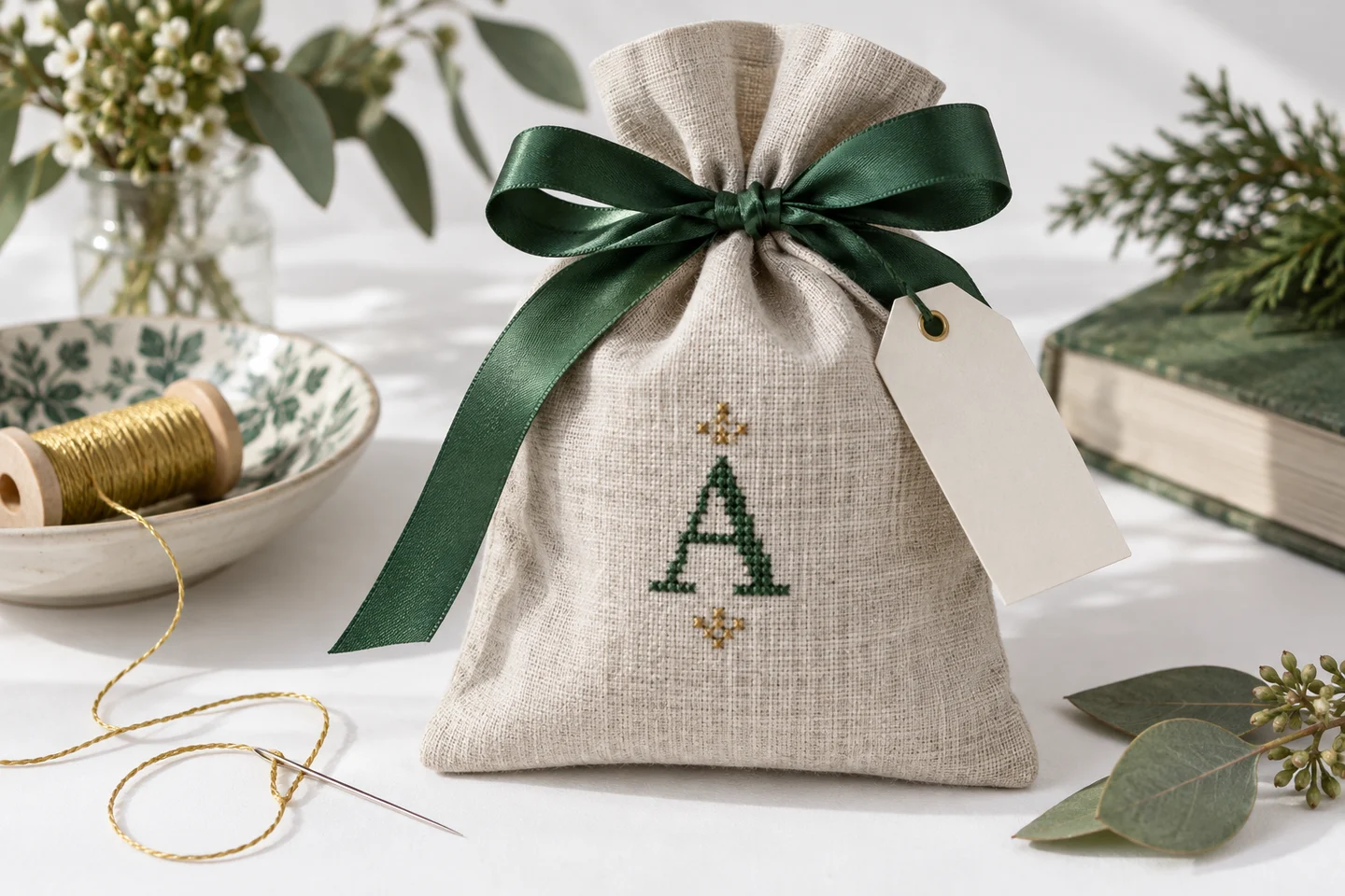
Design around the object
A bookmark needs a narrow composition; a card insert may need a short horizontal line. Measure the usable opening, then convert it to stitches. On 14-count Aida, a two-inch width gives 28 stitches. A name longer than that may need a smaller alphabet, two lines or a different finished format.
Keep the alphabet consistent
Choose one lettering style for the main text and limit decorative additions. Mixing several alphabets in a small area can make the piece difficult to read. Check that every required character is actually included. A missing accented letter is not a minor detail in someone’s name. Our simple generator supports A–Z and spaces and states that limit explicitly.
Plan a sample layout
Write the full text on a grid and count the spaces. For our five-by-seven alphabet with a one-cell gap, a four-letter word uses 23 columns. At scale two, every original cell becomes a two-by-two block, doubling both dimensions and roughly quadrupling the filled area. Scaling is useful but changes the visual weight as well as size.
Prepare a dependable chart
Give the text a clear color symbol and keep any border colors distinguishable. Add the final stitch dimensions and fabric requirements to your working notes. Recheck the spelling on the chart itself, not only in the text field. Download a free alphabet PDF for a short test word before creating the final gift. Love Letters offers a compact example of full-cross lettering with comfortable blank fabric around the text. Let the finishing method determine the final margins.
Start with the recipient and the occasion
A personalized alphabet project works best when its message is clear and its format suits the person receiving it. A monogram, a short name and a longer quotation create different design demands. Before choosing motifs, write the exact text and decide where the finished piece will live. A bookmark must remain narrow, a framed picture can allow more breathing room, and a sewn label needs space for its attachment method. The object should guide the layout from the start.
Consider practical preferences as well as decorative ones. Someone who likes restrained interiors may appreciate one color and a small border more than a crowded sampler. A child's name can be paired with a simple motif without adding a full scene. Use the alphabet tool to try the text in an original block style, then compare the stitch dimensions with the object. Its supported uppercase A–Z letters and spaces are useful for straightforward names, but unsupported characters need a separately designed and checked chart.
Choose one clear focal point
A gift can contain text, a motif, a border and a date, but they should not all demand equal attention. Decide which element carries the message. If the name is the focus, give it enough size and contrast to read first. If the motif is the focus, let the text support it in a quieter position. This hierarchy makes a small chart feel intentional and prevents extra decoration from obscuring the personal detail that makes the gift meaningful.
Try a simple paper layout before counting every stitch. Place rough rectangles for the text and image, leaving visible gaps between them. Then replace those rectangles with the actual grid dimensions. A Little Heart, Tiny Tulip or other small original motif can complement a name without requiring a large frame. Keep the motif's occupied area in mind: the outer chart rectangle may include empty cells, and those cells affect how closely the lettering can sit beside the visible stitching.
Build a master grid for the whole composition
Separate elements need one shared plan. Record the stitch width and height of each component, then place them on a blank cross stitch grid. Mark a common centerline or baseline and count the gaps explicitly. Without a master grid, it is easy to stitch a correctly counted name and a correctly counted motif that are incorrectly positioned relative to each other. The composition is a chart in its own right, not merely a collection of smaller charts.
For a centered name beneath a flower, decide the vertical gap and align the visual centers before calculating the final rectangle. If the components have different odd-even widths, choose the one-cell offset deliberately. For an initial, inspect how the surrounding motif balances its open and solid areas. The lettering and names guide explains these spacing decisions in more detail. Save the combined plan with the component charts so you can reconstruct the intended positions after setting the project aside for several days.
Translate stitch dimensions into a useful gift size
A design that looks compact on screen can become too large for a ready-made mount. Convert the final stitch rectangle using the intended effective fabric count before buying a frame, pouch or card blank. On fourteen stitches per inch, a seventy-stitch-wide composition spans five inches before margins. The cut fabric must be larger still. A frame's labeled size may describe the opening or the inserted artwork area, so measure the actual product instead of relying on an approximate retail description.
Use the fabric size calculator for the stitched dimensions and add finishing allowances appropriate to the object. For a sewn item, account for seams, folds and any backing. For a hoop display, allow enough cloth to secure the back. If the result is too wide, shorten the text with the recipient's preferences in mind, move to multiple lines, or choose a smaller stitch scale. Changing fabric count is another option, but it also changes the physical stitch size and the working experience.
Select a restrained, coordinated palette
A short palette helps text and image look like one design. Start with a strong lettering color, one or two motif colors and, if needed, a quieter accent. Repeat a color between the name and the motif to connect them visually. Avoid assigning a new color to every letter unless that effect serves the gift; too many changes can make a short word harder to read and increase finishing work on the back of a small piece.
Compare actual floss with the fabric and the final object's materials. A warm cream card mount may change how a cool white thread looks, while a dark pouch can make a pale motif stand out strongly. The site's generic colors are visual references rather than verified branded thread codes. Use the palette tool for exploration, then make physical choices under useful lighting. If a gift combines multiple separately designed charts, reconcile their palettes before stitching so nearly identical shades do not create accidental inconsistency.
Keep the project manageable for the deadline
Personalized gifts often come with a date, which makes realistic planning important. Count the actual occupied stitches where possible and consider the number of color changes. Include time to proofread, stitch, correct small mistakes and finish the object. A design can be quick to stitch but slow to assemble if it needs careful sewing or custom framing. Leave a buffer for materials that arrive late or a finishing method that requires a practice attempt.
The time estimator can help you explore a range using your own comfortable pace, but it cannot guarantee completion by a particular day. If time is short, simplify the design early. A single initial with a small flower can be more successful than an elaborate sampler finished in a rush. The mini project guide offers ways to choose compact motifs while preserving a satisfying result. Reducing unnecessary elements is a design choice, not a failure to make the gift personal.
Match the finish to how the gift will be used
Display pieces, bookmarks and sewn accessories face different demands. A framed piece may need careful mounting, while a bookmark benefits from a neat backing that protects loose thread ends. A decorative patch needs an attachment plan compatible with its base material. Before washing, pressing or applying adhesive, check the instructions for the fabric, thread and any specialty materials. Test unfamiliar finishing products on a scrap rather than on the completed name.
Do not trim the fabric to its final edge until the finishing steps are understood. It is easy to remove excess material later, but difficult to add it back after cutting too close to the stitches. The fabric margins and framing article helps distinguish the visible border from the mounting allowance. If you sew a backing, mark the seam line separately from the chart boundary and leave enough room for turning or folding according to the construction method you have chosen.
Add a useful record with the finished piece
A small care note can make the gift easier to look after. Base it on the actual materials and finish rather than a generic promise that every stitched item is washable. Keep a private record of the thread labels, fabric count, chart version and exact spelling. This helps if you later make a matching gift or need to repair a damaged stitch. It also prevents the next version from relying on a low-resolution photograph of the finished object.
Before wrapping, inspect the text one final time, remove visible marking guides according to their instructions, and check that the piece sits straight in its finish. Look for loose ends that might show through open fabric and for edges that need protection. For a future coordinating project, save the original alphabet chart alongside the motif plan. The most effective personalized gift is not necessarily the most complicated one; it is a clear message, carefully placed, with a finish that supports how the recipient will use it.
Cross stitch alphabet & text maker · Download the original love letters pattern
Examples, diagrams and planning estimates are original Cross Stitch Creator content.