
A pattern maker is most useful when it lets you inspect the real stitch data before exporting. Treat the controls as a sequence of decisions rather than a search for a magic perfect setting.
Set composition first
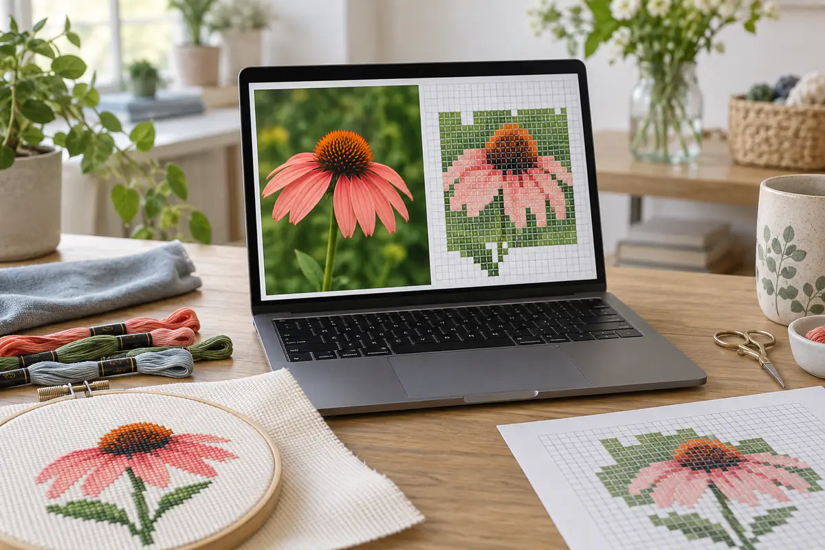
Upload a JPG, PNG or WebP with a clearly visible subject. Keep the original proportions or choose a deliberate square crop, then reposition that crop. Transparency is placed against your chosen background. Check the edges carefully: a pale subject on a pale background may disappear after the colors are reduced.
Set physical ambition next
Choose stitch width and fabric count together. The same 100-stitch chart is about 7.14 inches wide on 14 count and 5.56 inches on 18 count. Changing fabric count does not add detail to the chart. Use a larger stitch grid only when the extra detail justifies the extra work.
Tune tone before adding colors
Brightness changes the overall lightness, while contrast separates light and dark areas. Saturation changes color intensity. Strong adjustments can discard useful detail, so regenerate and compare after a small change. Once major features are clear, choose the smallest palette that keeps them recognizable. Review dithering separately because it changes the distribution of individual stitches.
Know what the export includes
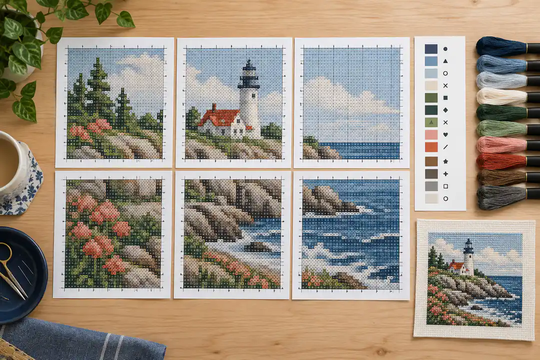
Our custom PDF contains the preview, fabric dimensions, color key, stitch counts, an approximate floss list and chart sections with distinct symbols. A4 and Letter, plus color and black-and-white chart options, are available for the same saved purchase. The palette is generic and numbered; it is not an official DMC conversion. The free preview is separate from the $2.99 download. Keep your receipt and recovery email so you can retrieve that same paid pattern without buying it again.
Plan one complete project before exploring every control
A productive pattern-making session begins with a purpose. A pet portrait for a small frame has different priorities from a large landscape intended as a long-term project. Write down the object you want to finish, its available stitched area, and the details that must remain recognizable. Those decisions help you judge a preview. Without them, it is easy to keep increasing the stitch count and color count because the screen image looks more impressive, even though the physical project becomes less practical.
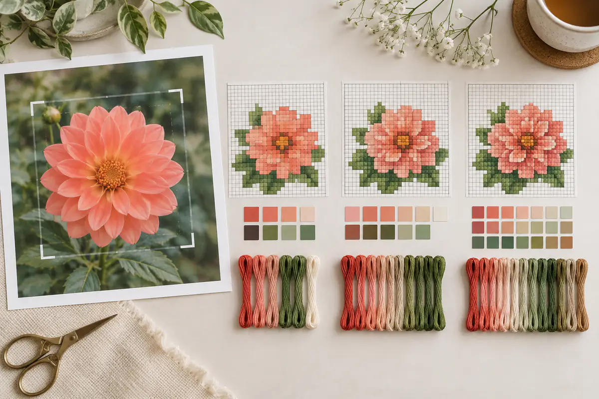
For a first custom design, choose one image and compare a few controlled versions. Keep notes such as “100 stitches wide, 16 colors, no dithering” rather than relying on memory. Use the photo selection guide if the subject blends into its background. A simpler composition is often a better starting point than a more expensive-looking source photograph. The maker cannot reconstruct detail that was never visible, and a large file is not proof that its main subject is sharply focused.
Treat the original and stitch preview as different views of the same composition
The comparison slider shows the source image beside a rendering of the reduced stitch data. Dragging the divider changes what you see; it does not change the pattern. Look at the subject’s outline, then inspect one or two important internal features. A tiny eye or flower center may need only a few correctly placed cells, but those cells must be distinguishable from the surrounding color. A pleasant overall impression can hide a missing detail that matters to you.
The stitched view is a simulation, not a photograph of a physically completed piece. Thread texture, tension, actual floss colors and fabric all influence the finished result. Use the flat grid and symbol view to check individual assignments. If you compare a square-cropped pattern with the full original photograph, the shapes will not align; the reference should use the same crop and orientation. Our saved source preview follows the selected crop, making the before-and-after comparison useful rather than merely decorative.
Use a small sequence of changes to understand the result
Change composition first, dimensions second, tonal adjustments third and palette size after that. This order prevents you from tuning colors in an area you later crop away. If a square crop removes too much of a pet’s ears, reposition it or return to the original proportions before touching contrast. If a narrow stem disappears at your chosen width, decide whether a larger grid or a closer crop better serves the project.
Change one setting at a time when comparing versions. Moving three sliders and doubling the palette simultaneously makes it difficult to know which change helped. Return to neutral settings if the result becomes confusing, then rebuild the adjustments in smaller steps. The size and color guide explains the difference between spatial detail and tonal detail. More colors cannot give a six-cell-wide face the same shape information as a face that spans thirty cells. These are separate limits, even when they appear in the same preview.
Connect the on-screen dimensions to fabric and time
A 120-stitch width measures approximately 8.57 inches on 14-count Aida. If the image is square, that is 14,400 possible positions before considering blank cells. A full-coverage photographic chart generally uses every position, unlike a small floral motif that leaves its background unstitched. Enter the dimensions in the fabric calculator, add suitable margins, and check whether that cloth fits your intended frame or working setup.
Time is another useful reality check. At a personal pace of 120 stitches per hour, 14,400 stitches represent 120 hours before additional overhead. This is an arithmetic example, not a recommended or typical speed. Your own rate may be much faster or slower, especially with scattered colors. Use the time estimator with measurements from your stitching. Reducing width from 120 to 100 on a square design reduces possible stitches from 14,400 to 10,000; that tradeoff may matter more than a small loss of background detail.
Review the palette as a shopping and stitching decision
The generated palette contains generic numbered colors. A hex value describes a digital color; it does not guarantee a particular commercial floss match. Compare physical thread samples together and record the brand and color number you actually choose. Neighboring shades should preserve the intended light-dark progression. Choosing each thread separately from a screen can produce a group that looks less coherent when the skeins are placed beside one another.
Check the stitch counts attached to each palette entry. A color used for only a few isolated cells may be an important highlight, or it may be unnecessary noise. The current maker does not promise a proprietary stitchability score or automatic professional cleanup. You decide whether the reduced chart is manageable. The palette viewer is useful for understanding color relationships, while the floss guide explains why per-color quantities and whole-skein rounding differ from a single total thread estimate.
Know what is saved when you generate a preview
Generating a preview creates a server-side pattern record with its own ID, cell grid, palette and settings snapshot. A later change produces another saved version. That separation matters because a payment should purchase the exact chart you reviewed, not whichever settings happen to be visible after you return from checkout. When you change a control, regenerate the preview before continuing to purchase. The checkout buttons remain tied to a completed saved conversion.
Keep the recovery email for a purchased pattern and save the downloaded PDF on your own device. A new conversion of the same photograph is not automatically the same saved record, particularly if its crop or palette differs. If you simply need a different paper size or a black-and-white chart, use the existing purchase’s export choices instead of buying a second design. Read the pricing explanation for the distinction between free previews, free public patterns and the one-time custom download.
Inspect the export before committing thread to fabric
Open the PDF and compare its cover dimensions with the preview. Check that the palette contains the expected number of colors, that the symbols are distinct and that every chart section has coordinates. Print a representative page on the paper size you selected. A screen can make fine lines and small text look sharper than a low-quality printout, so do not judge print readability from the cover alone.
Keep the legend available while stitching, even if you prefer a monochrome chart. In a multipage design, use the page map to identify adjacent sections and note that our chart sections do not overlap. The printing guide explains how to follow global row and column references. If you want to inspect the PDF format before making a custom purchase, download an original free pattern. That gives you a real chart, legend and printing workflow without entering the paid photo process.
Common questions about using an online pattern maker
Does a bigger preview mean a better pattern? Only when the additional cells preserve useful detail and the resulting workload suits you. A background full of tiny texture may look more photographic but become tedious to stitch. Can changing fabric count fix a blurry design? No: it changes physical stitch size, not the cell arrangement. Increase chart resolution or simplify the composition if the missing detail is important.
Can you generate a preview without creating an account? Yes, the local workflow supports that. Can you download every preview free? Public library charts and the blank-grid and supported alphabet tools are free; a saved custom photo PDF costs $2.99 USD. Does the site guarantee matching branded thread codes or Pattern Keeper compatibility? No. Use the stated generic palette, inspect the chart format, and choose materials deliberately. A clear limitation is more useful than an impressive claim you cannot verify with the actual file.
Create a free photo preview · Download the original little heart pattern
Examples, diagrams and planning estimates are original Cross Stitch Creator content.